WAYFINDING
Creating and designing the wayfinding signage was a collaborative project between our architect and her team, a signage vendor, Patricia Cue, and me. Mingei’s building was still in its renovation phase and one of the hardest parts was envisioning how the signs would look like, despite our Museum still being constructed.
A talk Patricia Cué and I did about designing the wayfinding signage in the museum for San Diego Design Week 2021.

This is what the museum looked like in 2020 when we started to plan where the wayfinding signage would go, what sizes each sign had to be, and what they had to be called.
room identification signage
The different sizes + slants we decided on for identification signage. The rebranded Mingei logo has a slant in the shape its contained in which is where I got the idea to incorporate it here. We wanted the signs to still feel slightly branded without distracting the visitor.
Each square on the grid is .375” (3/8”) because ADA requirements called for .375” (3/8”) of space around raised elements (letters) and Braille.
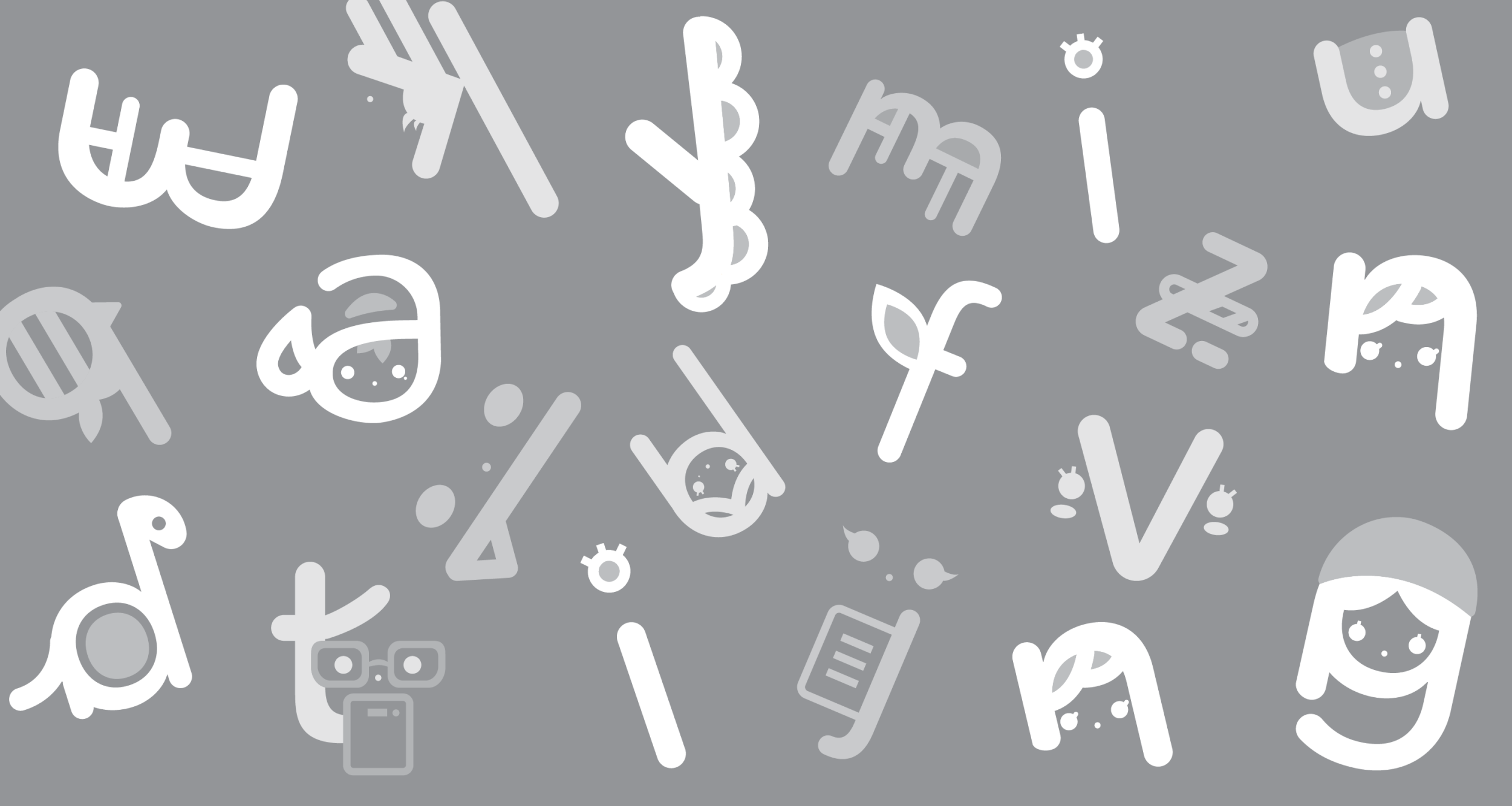
Our icons were created using characteristics of our typeface Mingei Mono. From using the “O” to create our restroom, courtyard and fire extinguisher icons to modifying our “E” for our elevator and mask icons.
Mingei Mono’s “O” is used in place of a regular circle for this circular icon grid (all icons reference our typeface). The first 2 rows of icons were done by Rhys Eusebio; this grid and examples of icons I had done were given to him as reference and he executed those 6 perfectly.
Afterward, icons are then adjusted to match the alignment of our wayfinding signage grid.
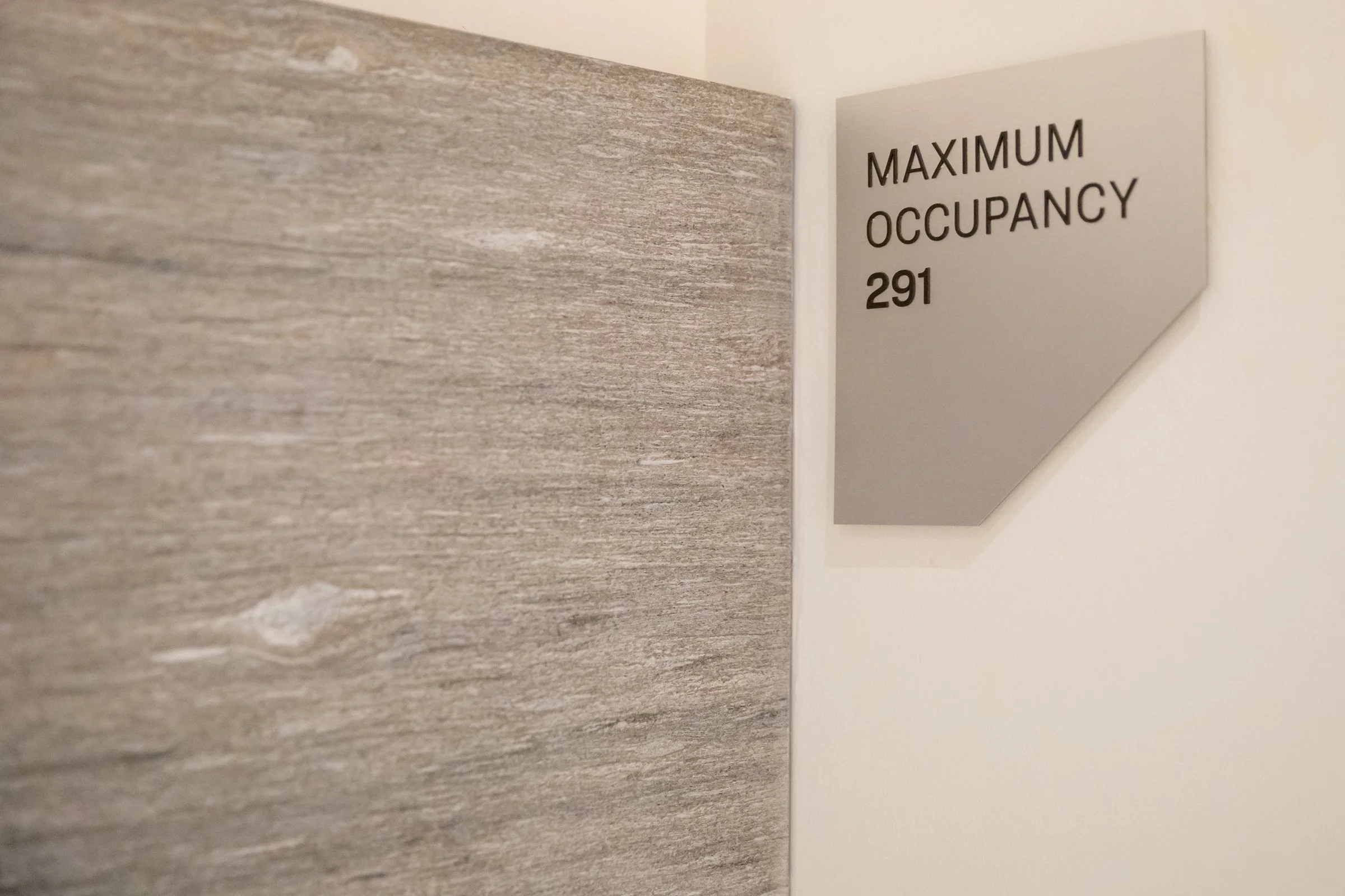
directional signage
Mingei’s logo is a responsive logo and when we rebranded, the designer had given us different shapes to house the type in. The three shapes were all options as part of the proposal, but ultimately, we felt that the 3rd shape could be successful in feeling like an arrow to guide visitors.


For our prototypes, we tried different type sizes, colors, and finishes for the signs. Some would go on columns, but some would go on wooden walls, so we had to make sure the color we chose was legible, yet looked good across different materials.